MAI
Brand Identity, Key Visual, Website
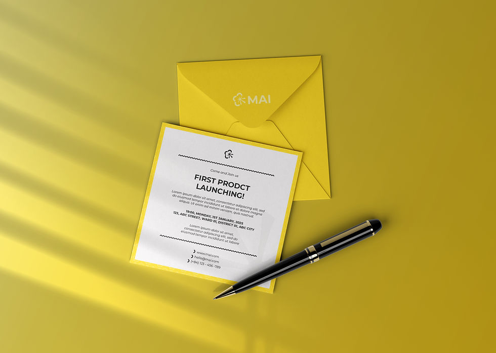

MAI is a major rice production enterprise. The name "MAI" carries a dual meaning: the vibrant yellow apricot blossom and "ngày mai"—representing the future. Consequently, the art direction embraces a fusion of modern technology (MAI's core strength) and a colorful, vibrant market presence.
Client
(Under QO Design)
MAI
Industry
Retail
Service
Art Direction, Brand Applications, Consultation, Key Visual Design, Label Design, Logo / Brand Guidelines, Logo Design, Visual Identity System, Website Design, Marketing Collateral
Date
2024
Location
Ho Chi Minh City, Ho Chi Minh, Vietnam
Let’s walk through the development of the MAI logo and its key visual pattern, including the initial design options.


The brand identity features a signature pattern and dynamic graphics applied consistently throughout the entire brand.


Website concept for MAI.


Other Projects
Brand Identity, Key Visual, Website


